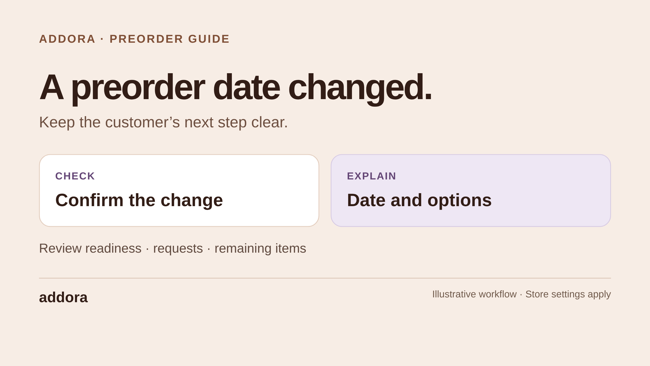
A customer notices a preorder on your collection page, checks its expected date, places an order and later receives an update. Each of those moments belongs to the same purchase. The wording and appearance should feel like they come from the same store, too.
Addora now gives you more control over both sides of that experience: the preorder information customers see while shopping, and the reminder and order-update emails they receive afterwards. You can choose how preorder labels and dates look across your storefront, then give Addora's customer emails your logo, colors and preferred background style.
This guide walks through what you can customize, how to preview it and what to check before putting the new look in front of customers. If you have not configured your products yet, start with our guide to setting up native Shopify preorders with Addora.
Start with the information your customers need
Consider a record store selling a forthcoming album. A small “Pre-order” badge helps someone browsing the collection understand that it is not ready to ship. On the product page, there is room for a fuller explanation and an expected availability date. A later email should help that same customer understand what changed and what they can do next.
The design should support those explanations. Before choosing colors, decide what your store means by an expected date, how you explain an unknown date and where customers go to review their purchases. An expected availability date is not automatically a promised delivery date.
Use the same terms wherever the same situation appears. If your product page says “Expected availability,” an email should not describe that date as a guaranteed arrival at the customer's home. When a release changes, our guide to handling preorder delays and cancellations explains how to keep the update clear.
Customize preorder information across your Shopify store
Open Settings → Pre-orders → Storefront & checkout → Preorder appearance in Addora. Start by choosing the place you want to edit: product pages, product cards, cart reminders or purchase notices.
Each place can use a saved layout. You can share a layout where a consistent look makes sense, or use different layouts for different amounts of space. A collection card may need a compact badge; a product page can carry a complete sentence.
Within a layout, you can choose which information to show and its order, including the preorder label, expected date and sold-out state. Each item can appear as a badge, plain text or a sentence. Arrange the items in a row or stack them, then adjust the wording and appearance.
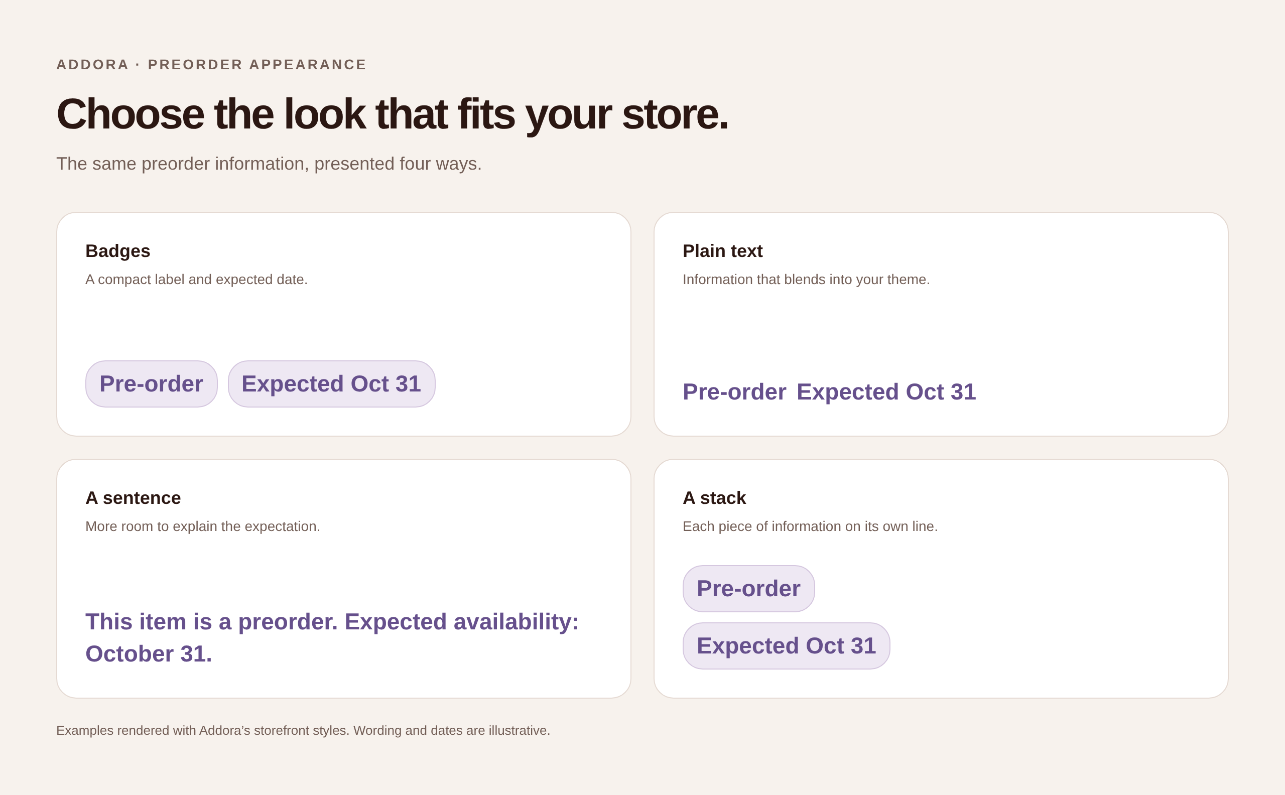
Open the full-size preorder appearance examples.
For example, you might use a subtle “Pre-order” badge and a short date on collection cards, then show “This item is a preorder. Expected availability: October 31” on the product page. The important part is that both communicate the same expectation.
Choose colors that belong to your store while keeping the information easy to read. You can adjust text, background and border colors, size, spacing and corners. Individual items can have their own style when you need a date to stand out from the preorder label.
Enable the places you want customers to see and follow the theme setup guidance for each one. Product-page information can be placed through Shopify's theme editor. Product cards may need the guided installation step or help with your theme before the chosen position appears. Check the result in your own theme rather than relying only on the settings preview.
Make dates and small product cards easy to read
Addora lets you choose short, long or numeric date formats. You can also decide how the layout handles a missing date and whether the date stays visible when an item is sold out.
Those states deserve their own wording. “Date to be confirmed” is more useful than an empty-looking badge, and it avoids inventing a date you cannot support. If a product has variants with different dates, check the relevant variants rather than assuming one date represents the whole product.
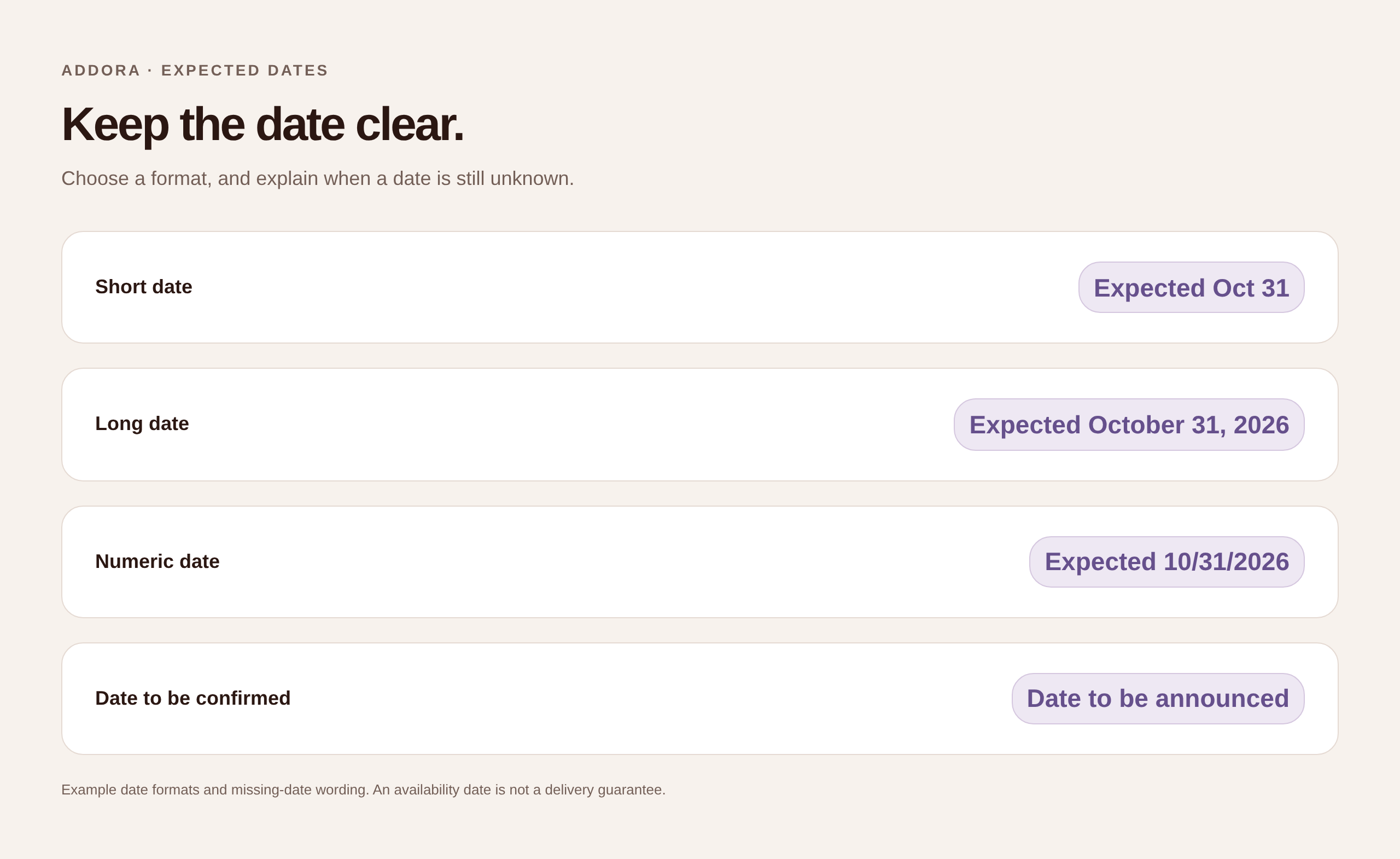
Open the full-size date styling examples.
For product cards, Adapt to card width helps the information fit narrow and wide cards. You can choose smaller and larger text sizes, compact spacing and shorter wording for narrow cards. The editor shows small and large examples together, making it easier to spot a label that works on desktop but takes too much room on a phone.
Keep the short version meaningful. A date-only label can work beside a clear preorder badge; an unexplained date on its own may be harder to understand. Preview the whole group of information, not just the item you are editing.
Give Addora's customer emails your store's look
Once the storefront information is clear, open Settings → Customer experience and find Email branding. These settings control the shared appearance of Addora's reserved-item reminders and order updates.
You can upload a logo from your computer or use a public image link. Addora accepts PNG, JPEG and GIF logo uploads up to 2 MB. If you leave the logo blank, the email uses your shop name instead.
Choose an accent color for buttons, links and highlights, then select a background style: Warm, Clean or Mist. These give you a starting point for the email's overall appearance without rebuilding a template for every message.
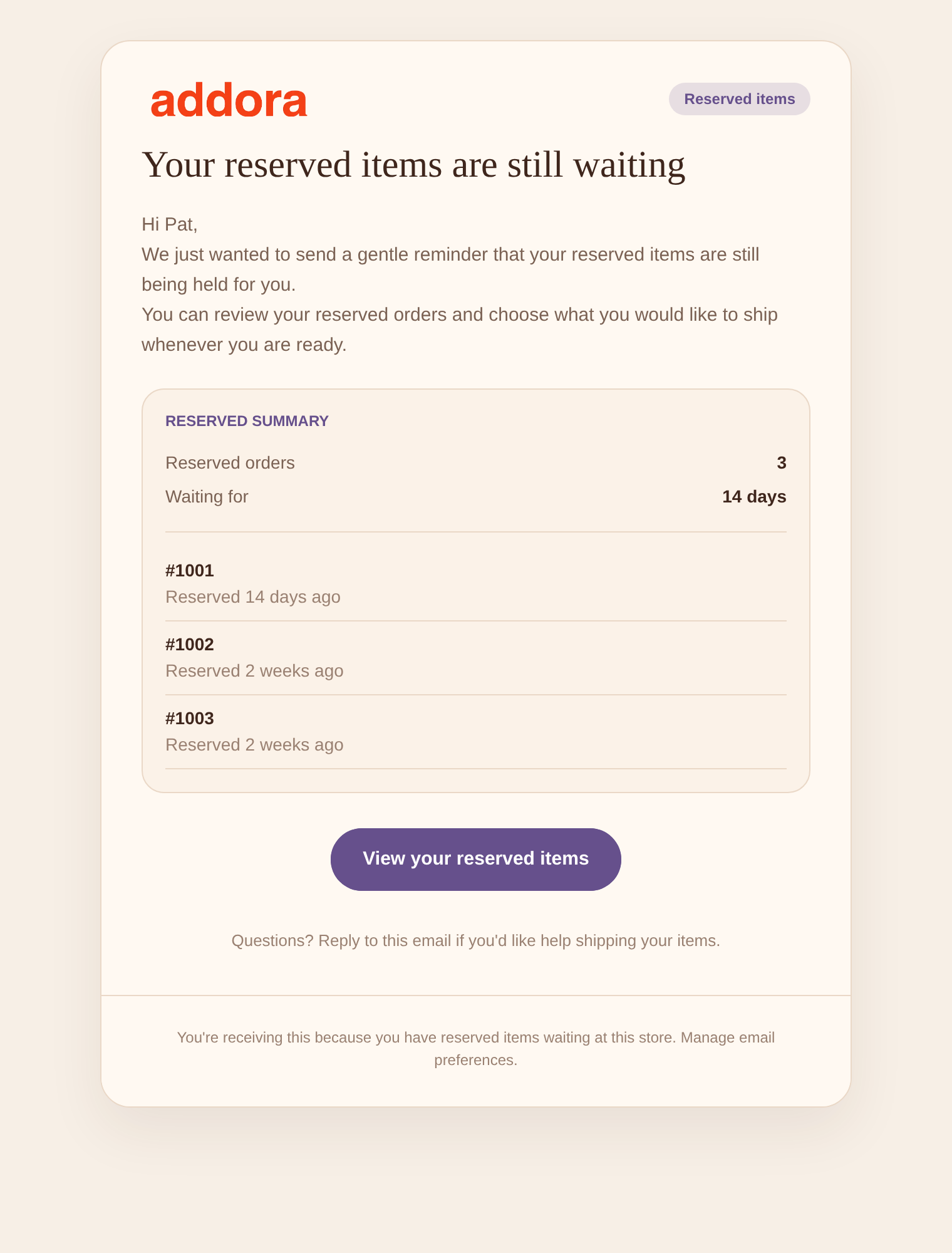
Open the full-size reserved-item reminder email.
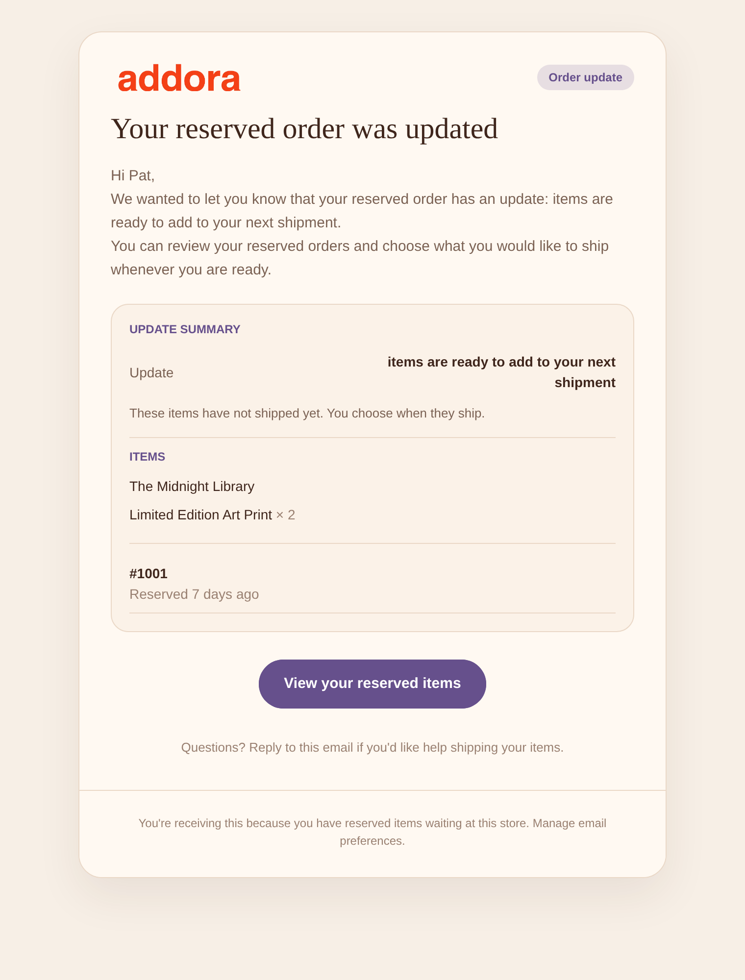
Open the full-size order-update email.
The shared style applies to both supported email types. Their wording remains in the separate email editors, so you can give reminders and order updates different messages while keeping the same visual identity.
Reserved-item reminders help customers return to purchases they have left waiting. Order updates explain relevant changes to held items. If you want to understand the reminder workflow before editing its appearance, read Customer Email Reminders for Reserved Items.
These controls style Addora's emails. Shopify's own order-confirmation emails have separate settings in Shopify. Reminder and order-update emails are paid-plan features starting on Starter; the pricing page explains the current plan differences.
Preview the message as well as the design
Use the preview beside the editor to check both the reserved-item reminder and the order update. Switch between desktop and mobile views, and review the plain-text version as well as the HTML email.
Look beyond whether your logo fits. Is the main message easy to find? Does the button explain where it takes the customer? Is it clear whether the customer needs to choose a shipment, or whether the message is simply an update?
For example, “Your reserved items are still waiting” should not read as though a parcel has already shipped. The destination should help the customer review their held purchases and available actions. Our article on held orders in Shopify customer accounts shows how that part of the journey works.
Save the style before sending a test email to the shop contact. Open that email on a phone as well as a larger screen. A preview helps you edit, while a received test lets you check the result in an actual inbox.
Check the complete journey before you finish
Use one representative preorder to review the experience from browsing to email. Then check the less straightforward cases: a missing date, a sold-out item and a product with different variant dates.
- Check the collection card on a phone and desktop, including longer wording.
- Open the product page and confirm that the selected variant has the right expected date.
- Check the cart reminder and purchase information for a consistent explanation.
- Review the reminder and order-update emails with the shared style applied.
- Send a test email after saving and check its logo, text and links.
- If you sell in several languages, review your custom wording in each storefront language you use.
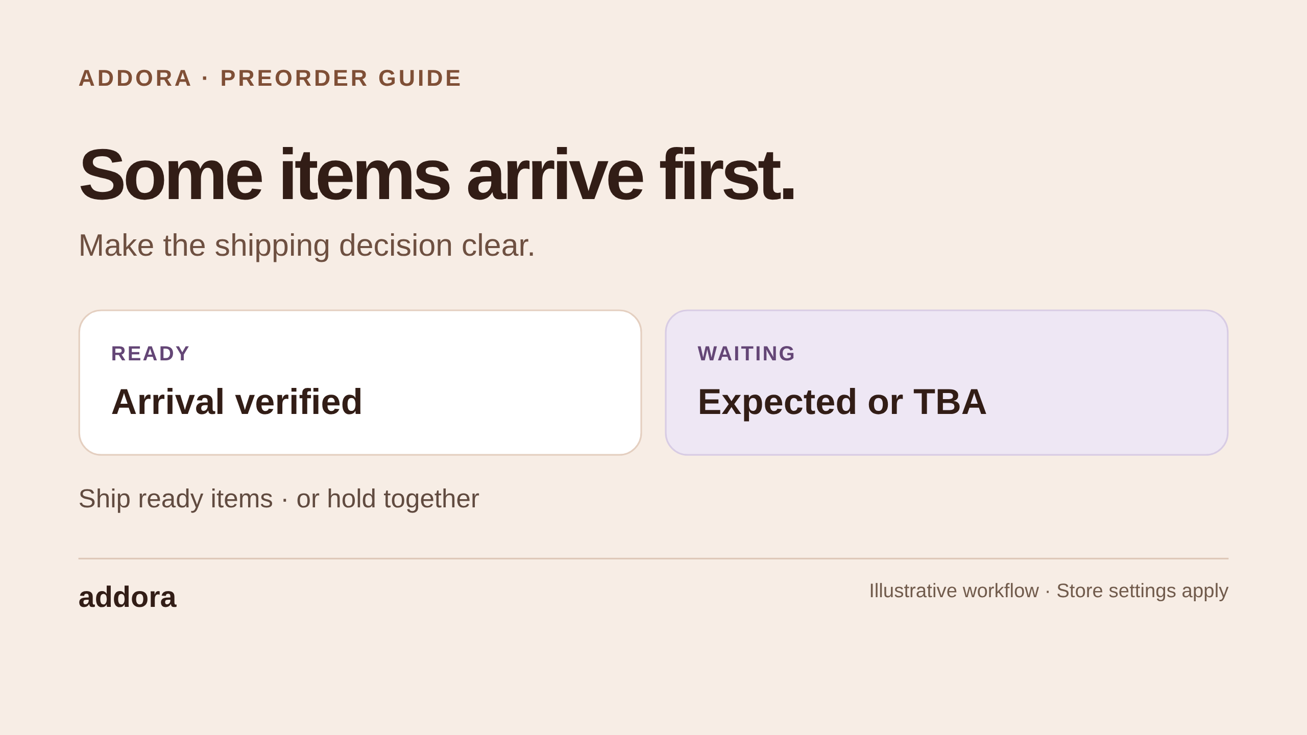
For stores combining preorders with available products, also check how you explain what can ship now and what will wait. Our guide to Shopify split shipping for preorders and in-stock items covers that decision.
Common questions about preorder and email styling
Can product cards and product pages use different styles?
Yes. Each place can use its own saved layout, or share one with other places. This lets you keep product cards compact while giving product pages more explanatory copy. If you edit a shared layout, check every place that uses it.
Do I have to style every customer email separately?
No. Email branding provides one shared logo, accent color and background style for Addora's reserved-item reminders and order updates. You can still edit the message for each email separately.
Does changing the design change when a preorder ships?
No. Appearance settings change how information is presented. Product readiness, release dates and your shipping setup still determine the order's journey. Keep those settings accurate before choosing the words that describe them.
Do these settings change Shopify's order-confirmation email?
No. Addora's email branding applies to the two Addora email types described above. Manage Shopify's own notification appearance in Shopify.
Build a consistent experience around a clear promise
A compact collection badge, a useful product-page explanation and a recognizable email all serve the same purpose: helping the customer understand the purchase they have made.
Start with a layout that suits your store, preview the different states and bring the same visual identity into your emails. Keep dates and next steps clear throughout. For the wider setup, see How to Set Up Addora: Shopify Preorders and Ship Later.